Playing with Color
Reflections on a new series of layered glass and silver, where joy, light, and color take center stage
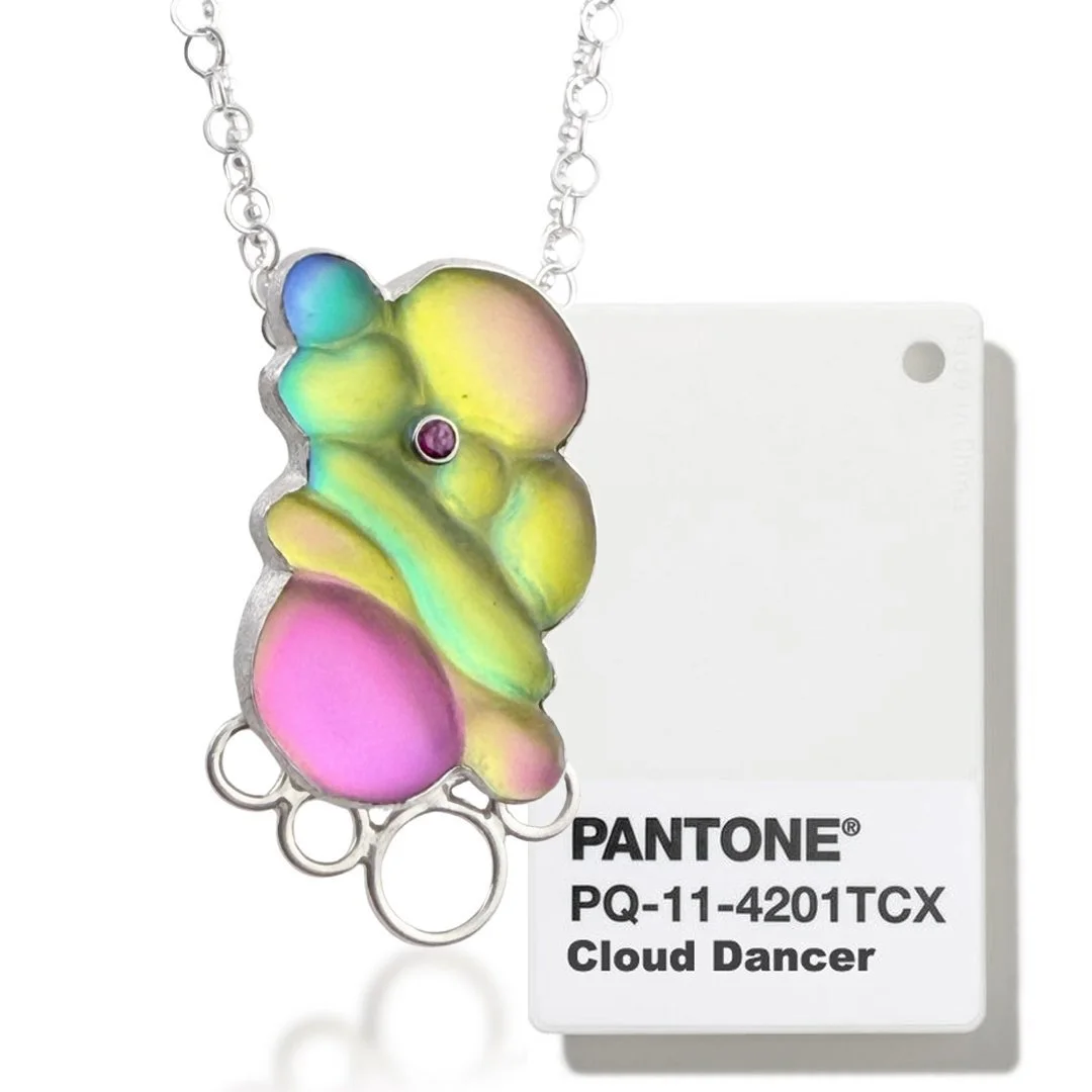
WTF Pantone?
Recently, Pantone announced their Color of the Year, an annual choice that often influences fashion, design, and color trends. This year, they chose Cloud Dancer, a soft shade of white.
My immediate reaction was, really??
White?? A white palette felt bland and completely bored me. Hearing it framed with broader cultural and political associations genuinely angered me. I was annoyed that somewhere, a boardroom full of seemingly intelligent people sat around talking about what’s happening in global culture right now, and all they could come up with was off-white. Seeing a tone that is essentially the absence of color elevated as the color of the moment was, honestly, irritating.
I know my business blog isn’t necessarily the place to get into politics. But if you’ve been following me for a while and you’re still here, you probably already have a sense of where I land. I can’t help but channel my reactions to the world around me into my work. My work is almost always a response to something happening in my life, problems I’m trying to sort out in my own head, sometimes before I even realize that’s what I’m doing. This series is very much a reaction to what’s happening in our country right now, even if it comes across as fluff, lol.
I knew I needed to create pieces full of color—colors that don’t just sit next to each other, but actually coexist within the same piece. In that moment, I decided to revisit a series I had started a while back, one that checked all the right boxes.
It all clicked. If neutrals are the “it” thing, colorful accessories go hand in hand with a neutral wardrobe. So… win/win, lol.
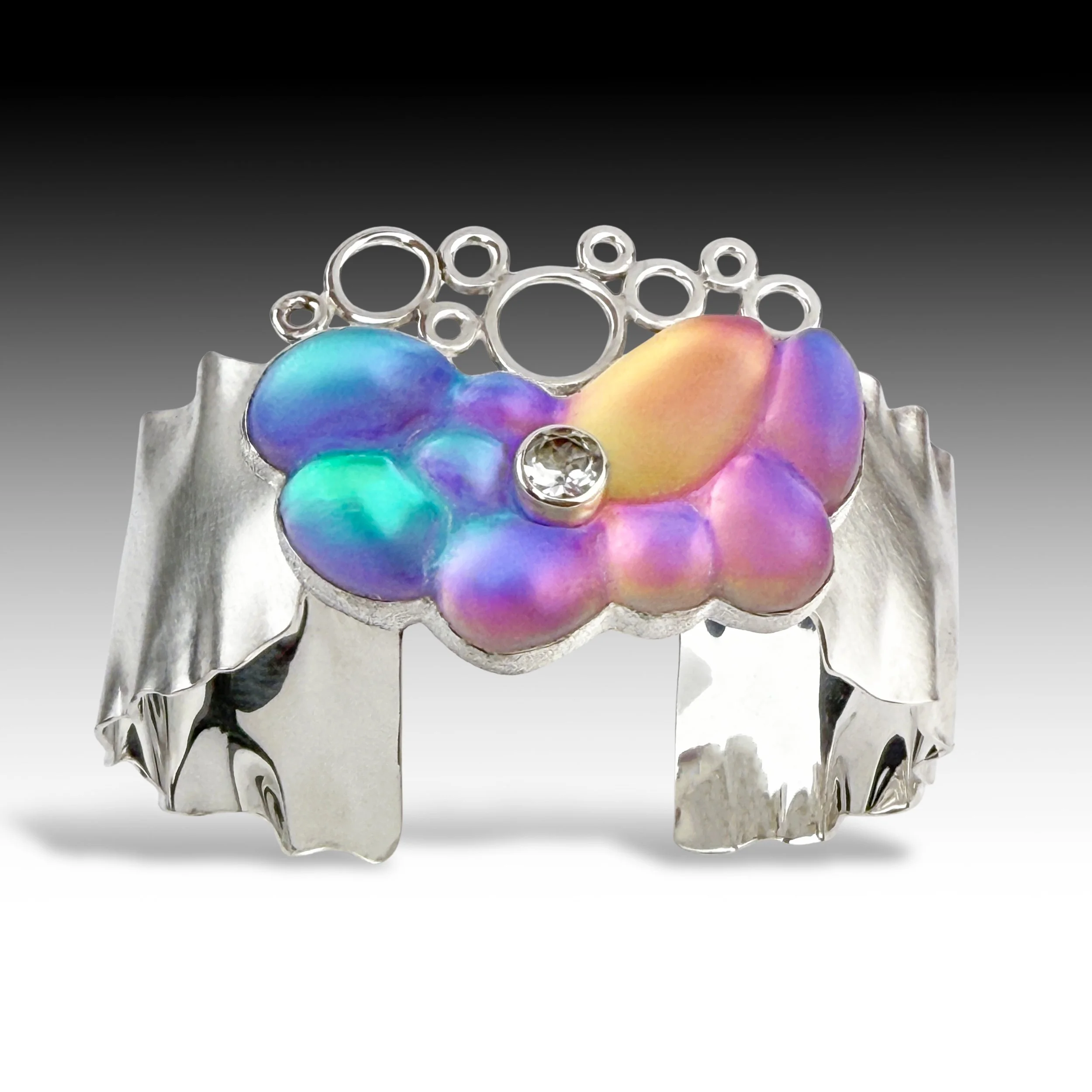
Experimenting with Mosaic Color
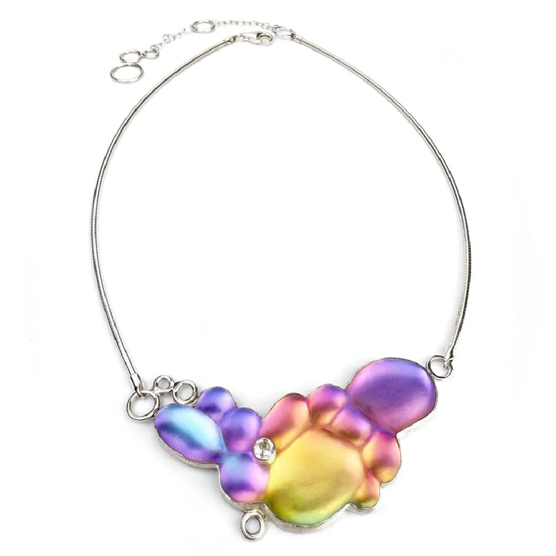
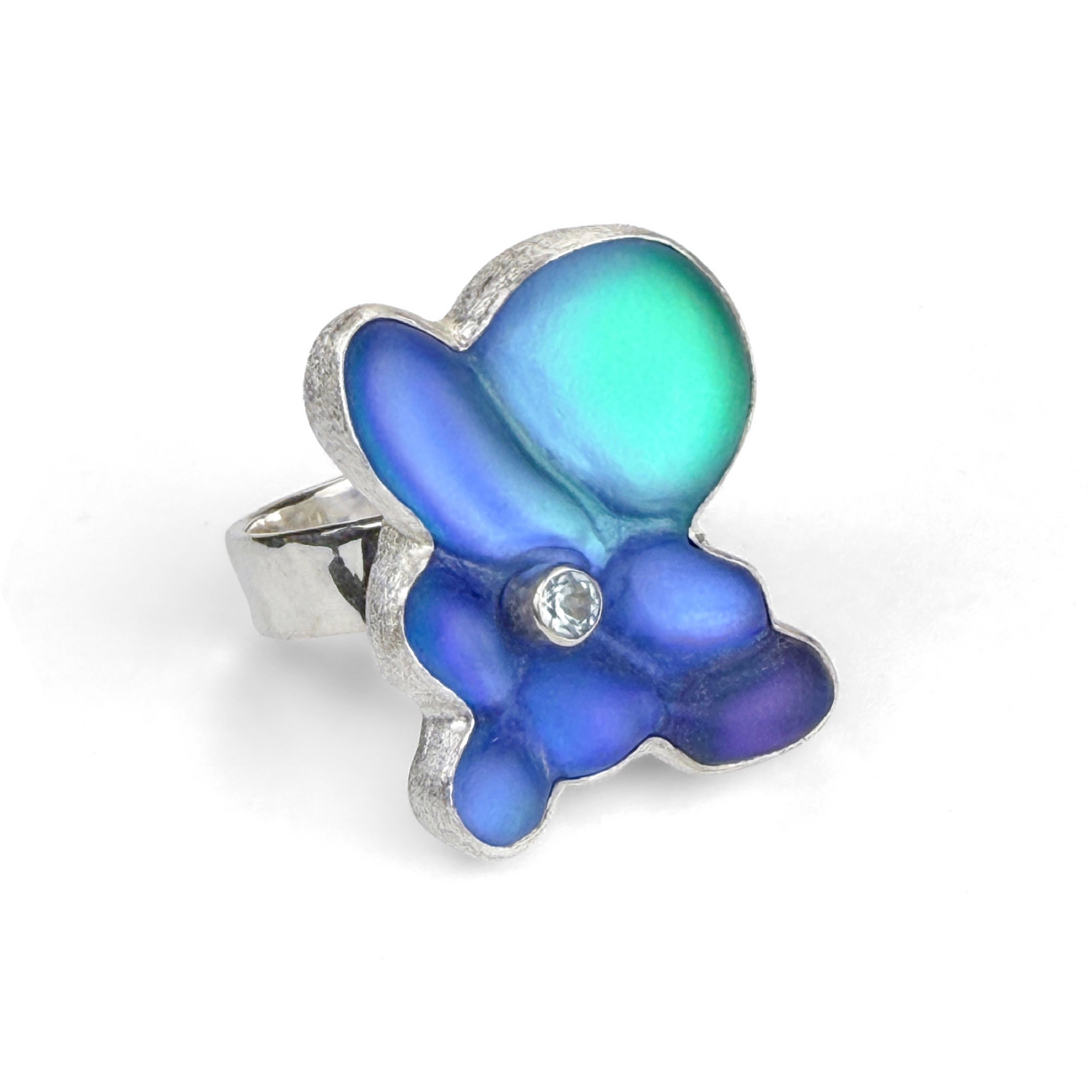
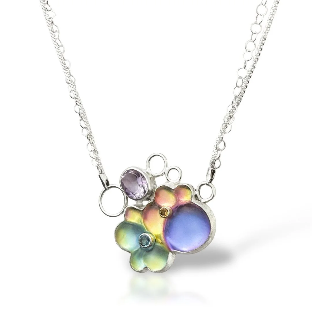
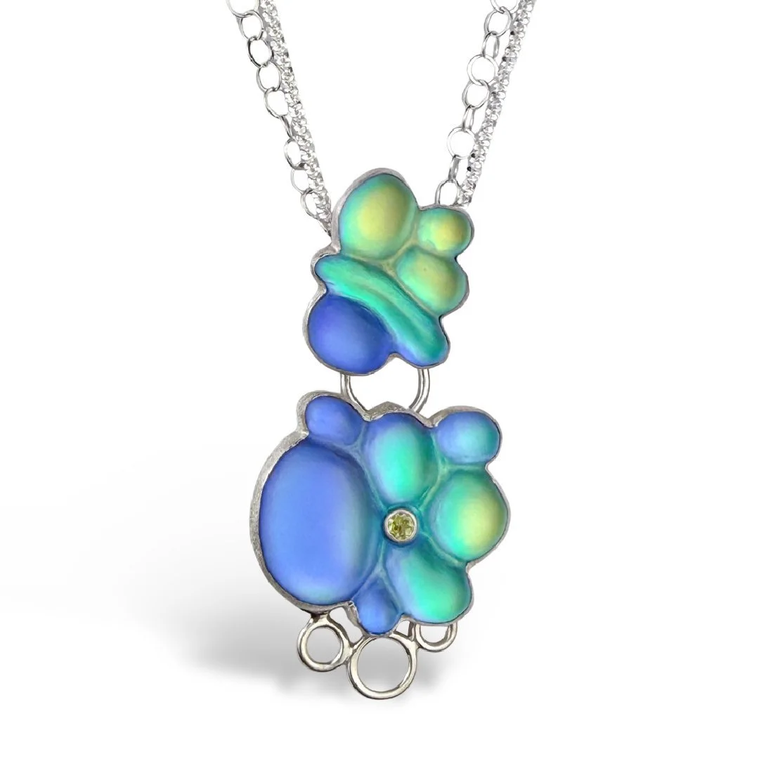
In this series, I’m approaching the glass-making process a bit differently than I usually do. I’m adding multiple colors within a single piece of glass, almost like creating a horizontal mosaic, along with the layers of shifting color I usually layer in. Instead of focusing on one dominant hue like I normally do, several colors now live together within the same form.
I’m playing with the push and pull of color inside the glass beneath the top layer of optical glass, creating pools that shift and blend into one another, then carving back into the finished piece to visually break them up again. It’s been a slow, exploratory process full of small surprises, and lots of mishaps, lol.
The Studio as Refuge
It’s hard to escape the endless news cycles. We’re living through some genuinely unsettled times. There’s so much that feels outside our control. The studio is my place of refuge and recalibration. It’s a space where I can shut out the noise and confusion of the outside world and focus on color, shine, and possibility.
Throughout my career, I’ve made a conscious decision to create work with an undertone of joy, even when that choice ran counter to prevailing trends. That commitment shows up in bright, unmuddied color, sparkling gemstones, and polished, reflective silver. These material choices are essential to how I work. Over the years, I’ve fully embraced my aesthetic and leaned unapologetically into color, shine, and sparkle.
I think a lot about how, at least in my experience, happy work isn’t always taken as seriously as work with a darker or more “serious” vibe. I mean, jewelry making as a whole really isn’t seen as art by the vast majority of people, in my estimation. So I’m playing with a double whammy of things typically not taken all that seriously, lol. Maybe that’s one of my own insecurities talking. Most artists have a few. But I’ve clocked people’s reactions to work I’ve made over the years, and it’s something I’ve noticed again and again. One critique I’ve received often is that I should blacken the silver to give my work more weight, and I’ve consistently fought against that opinion.
For me, joy and seriousness aren’t opposites. They can live in the same piece at the same time. And maybe choosing joy is even a little defiant—my own way of sticking it to the man who says I have to make “serious” work to be taken seriously, lol. This series is a reflection on coexistence. The multiple colors living together within a single piece are a direct metaphor for this country as a melting pot—distinct individuals sharing space, retaining their identities, and existing in harmony rather than conflict. This work is my personal statement and my refusal to accept the idea that difference must lead to division. This is where I stand. Making this work has felt hopeful. It feels good to spend my days making bright things.